F'ABS

PROJECT OVERVIEW
This is a case study project.
Wellbeing and fitness is a growing industry. People enjoy the convenience of being able to find health resources and to book classes on their mobile phones. However, a major challenge is that people don’t stay motivated for very long in their health journey. This project looks at how a wellbeing app can motivate and inspire users.
MY ROLE
UI/UX • Branding
MY TOOLS

WHAT IS THE PROBLEM?
•Excitement of fitness is lost in disengaging app designs
•Booking an in-person class may be difficult due to participant restrictions or time limitations.
Solution
•Digital resources can be anytime anywhere
•Design can motivate and inspire
PROCESS

• Competitor Analysis
• User Research
• User Journey
• Wireframes
• Prototyping
User Research
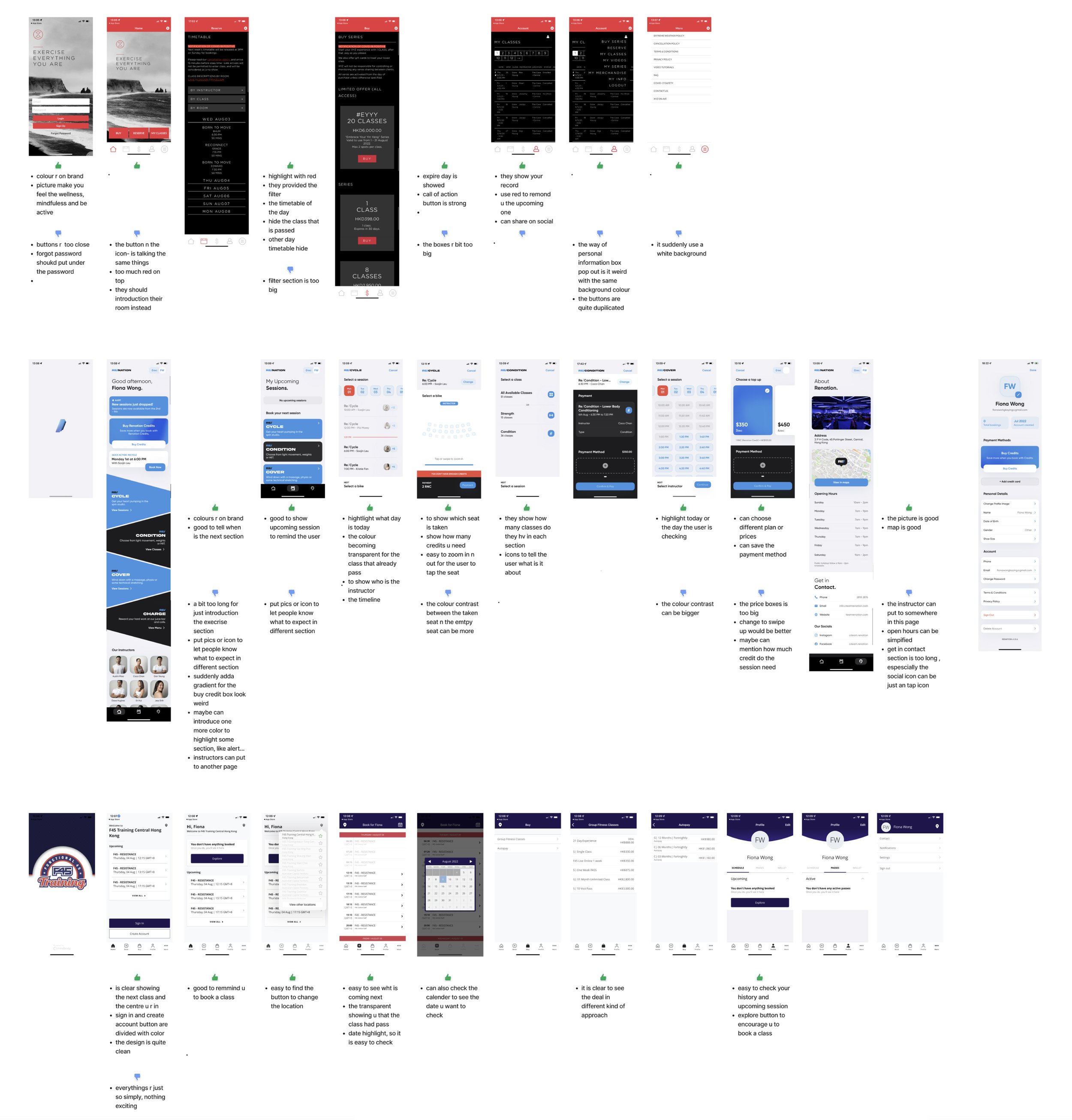
•Competitors research & analysis


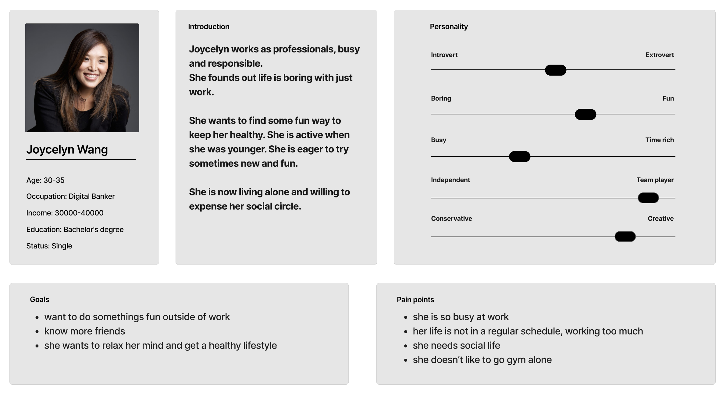
user persona
We are using a persona who is around early 30, professional.
user’s Pain points
•Busy and stressed at work
•Need support/ encouragement to get motivation
•Looking to have hobbies, not just surviving day-to-day
User JOURNEY MAP

user Flow

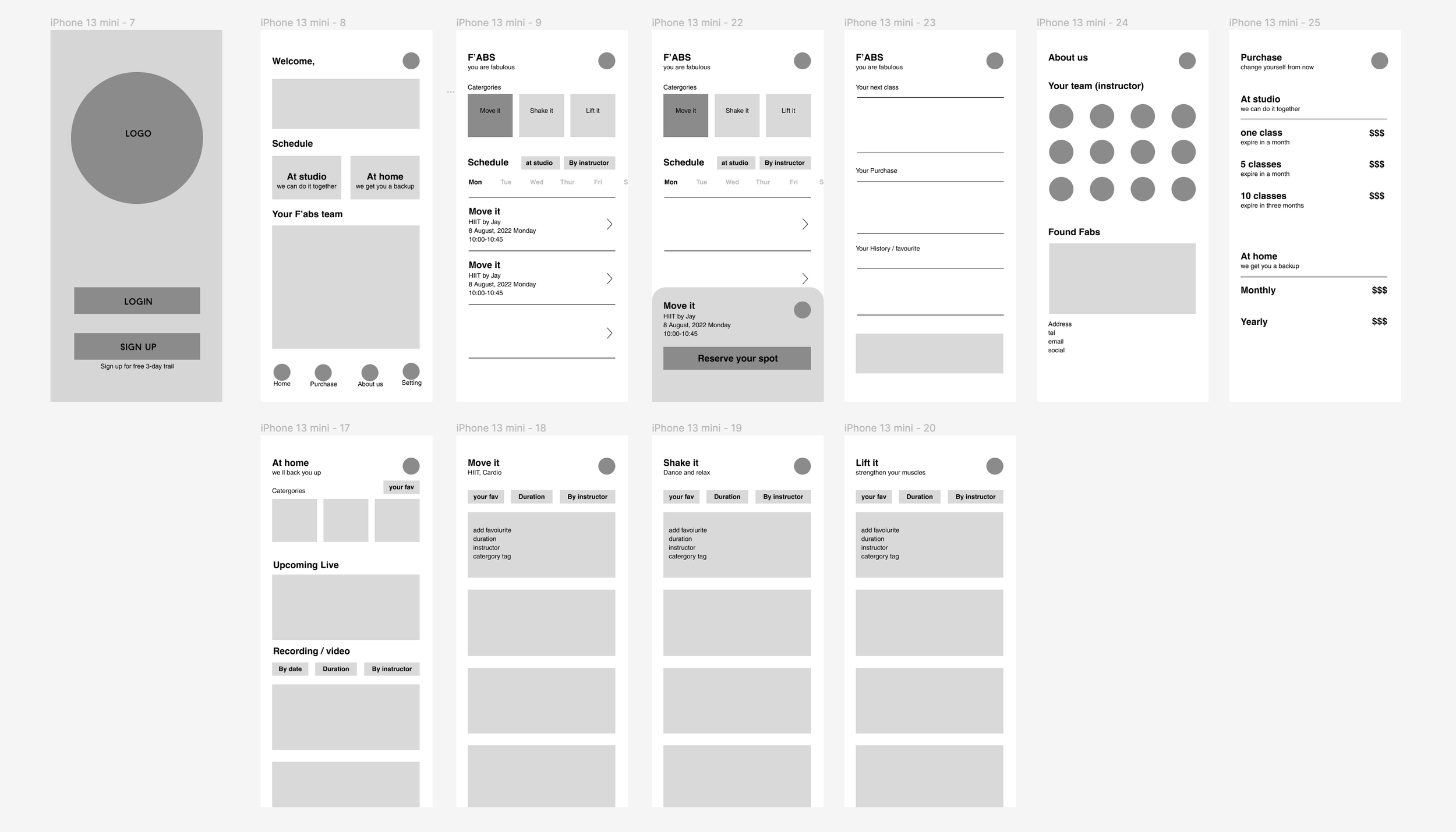
LOW-FIDELITY PROTOTYPES

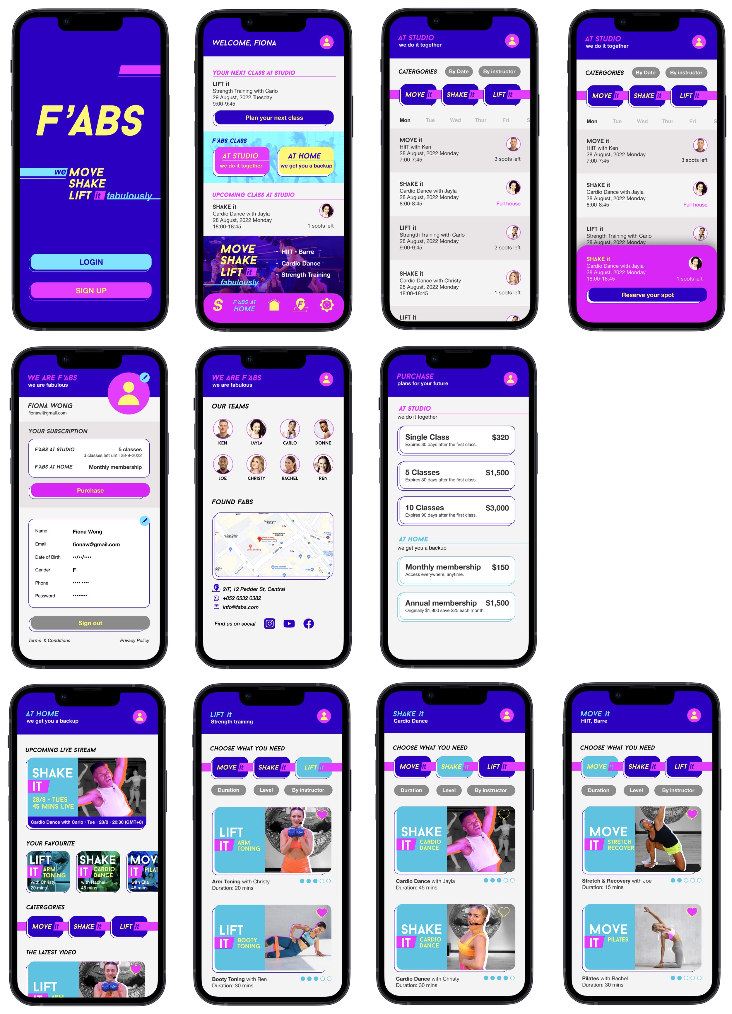
High-FIDELITY PROTOTYPES
This design emphasises:
Motivating Colours: Vibrant blues and neon colours create a feel of fitness and party vibes.
Dynamic Shapes: Create energetic visual elements.
Colour labelling is used to separate between the studio bookings and online resources.
Studios and online resources are organised to three core areas of Move it, Shake it, Lift it so users know what to expect.
